
09 — A name, an icon and a basic style for the showcase app
2026-10-16 · investigation report · macOS 27, Pixel 10 Pro (Android 17)
The next step bundles every proven feature (menubar, BLE bridge, direct sensor, LibreView, Nostr, status bar,
Garmin) into one showcase app that the user runs for a few days. It needs a temporary identity: a name, a
<name>.mauri.app domain, an icon for every place the app appears, and a few style decisions. The final app is
built from scratch later and may change all of this.
This spike produces candidates to pick from, not a final brand. It also includes the tooling that turns the chosen candidate into platform-ready files.
Result
Section titled “Result”Decision (2026-10-16): Sukrara, with the “live” icon. Sukr- (sucre, sugar) + ara (Catalan: now), so “your sugar, now”. The icon is a sugar cube with a neon live dot. Domain
sukrara.mauri.app; idsapp.mauri.sukrara(final) andapp.mauri.sukrara.poc(showcase); range colours A and SF Pro medium (today’s, not changed). Assets:poc/spikes/brand/assets/sukrara/.
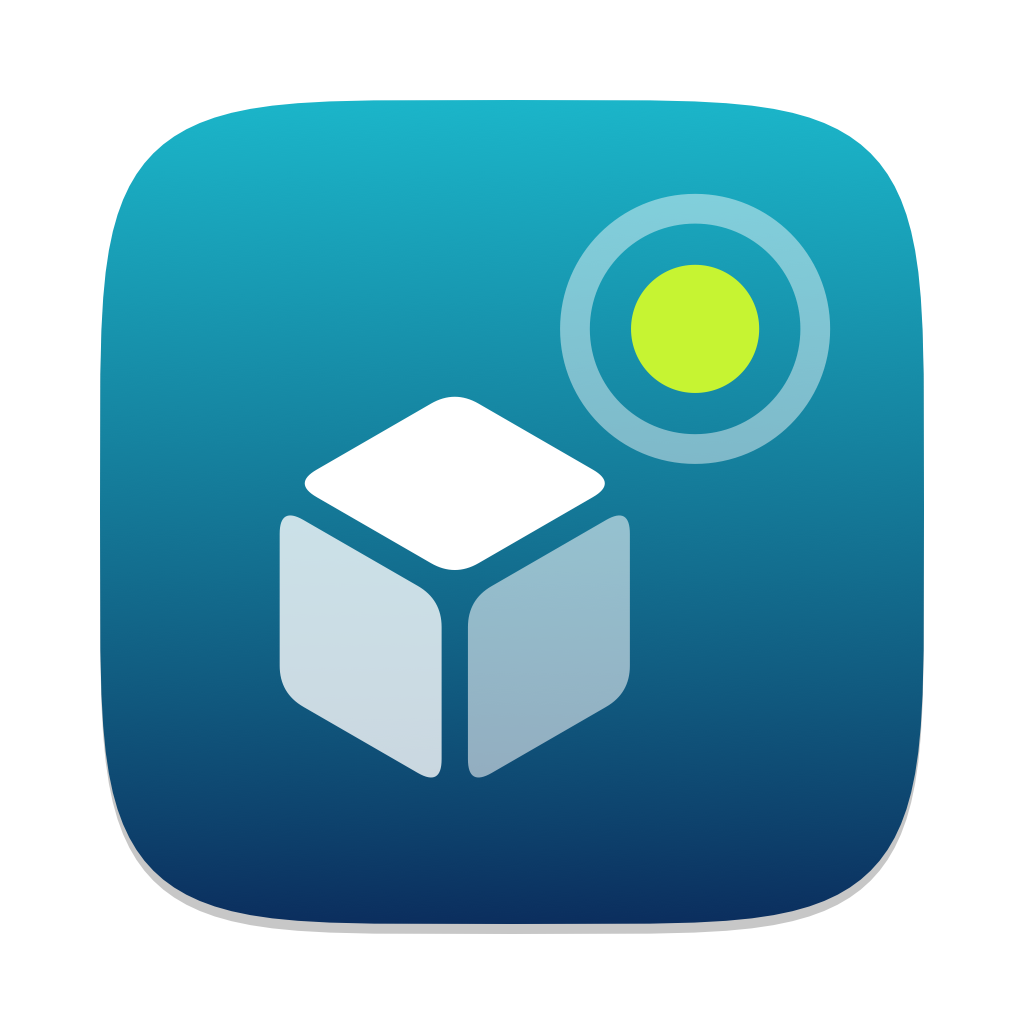
How we got there: six name + icon pairs in round 1 and fourteen “Sucre…” candidates in round 2, three range-colour kits and four menubar number fonts. They’re shown in a local gallery
(poc/spikes/brand/build/gallery/index.html) and, on the phone, in a preview app where every candidate is a real
launcher entry. brand.py export <id> turns the chosen one into macOS, Android, Garmin and web assets.
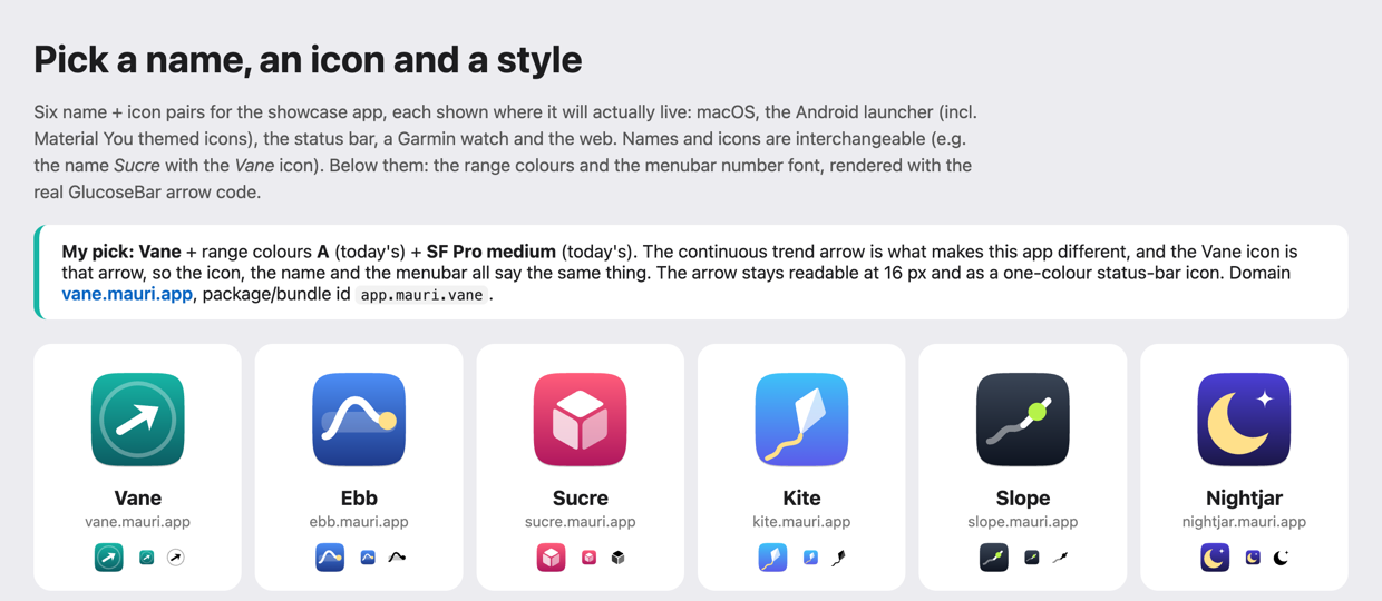
| Name | Domain | Idea | Icon |
|---|---|---|---|
| Vane | vane.mauri.app | A weather vane points where things are heading | The app’s own continuous-angle trend arrow, inside a dial |
| Ebb | ebb.mauri.app | Ebb and flow: glucose rises and falls like a tide | A wave through the target band, ending on the current reading |
| Sucre | sucre.mauri.app | Catalan (and French) for sugar; personal, warm | An isometric sugar cube |
| Kite | kite.mauri.app | Stays up inside a band of wind; the string shows the direction | A kite with a curving tail |
| Slope | slope.mauri.app | The trend is the slope of the curve | The tangent line at the last point of a curve |
| Nightjar | nightjar.mauri.app | A bird that keeps watch at night: remote follow, Nightscout heritage | A crescent moon with a star |
A web search found no glucose or diabetes app using any of these names. Names close to existing products in this space were avoided: Glimp (a Libre app), Tidepool, Nightscout, Gluroo, Libre, Dex…. Names and icons are interchangeable.
Round-1 recommendation (superseded): Vane, range colours A (today’s), SF Pro medium (today’s). What sets these apps apart is the continuous trend arrow, and the Vane icon is that arrow, so the name, the icon and the menubar all say the same thing. At 16 px the dial fades but the arrow stays clear, and it works as a one-colour themed icon.
Round 2: “Sucre” + a word about the app
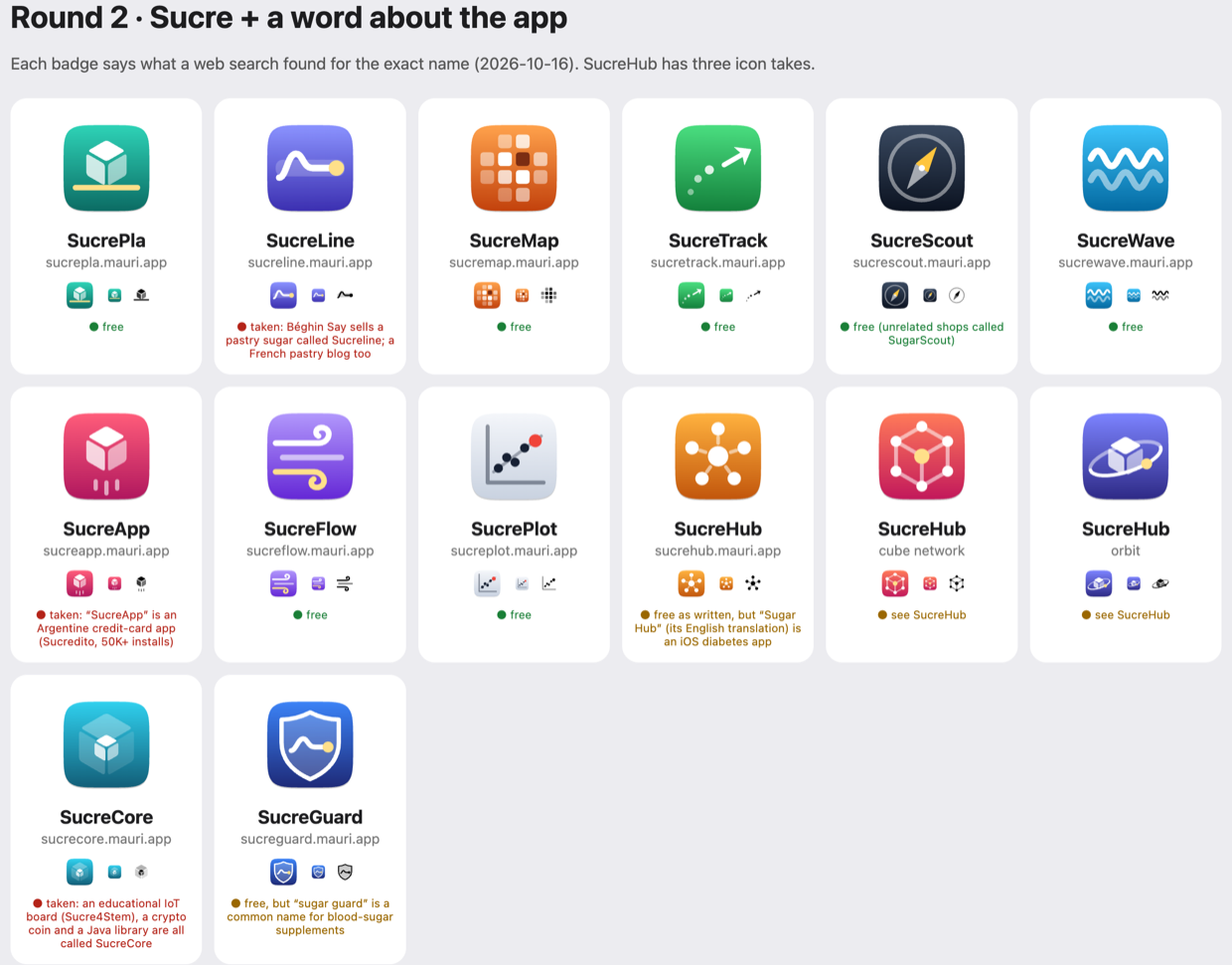
Section titled “Round 2: “Sucre” + a word about the app”The user liked Sucre but wanted a compound name that is easy to say and write and unique enough to rank in search. So round 2 is “Sucre” plus a word about what the app does: 12 names, with three icon takes for SucreHub. The badges show what a web search for the exact name found on 2026-10-16:
| Name | Search | Notes |
|---|---|---|
| SucrePla | free | pla = flat, plan, film shot. Icon: sugar cube standing on a flat line |
| SucreMap, SucreTrack, SucreWave, SucreFlow, SucrePlot | free | — |
| SucreScout | free | unrelated “SugarScout” shops; reads as a Nightscout alternative |
| SucreHub | free as written | but “Sugar Hub: Glucose & Insulin” is an iOS diabetes app, and SugarPixel Hub is a CGM display companion. Its meaning fits the architecture (the phone as the hub). The “-Hub” suffix is generic |
| SucreGuard | free | “sugar guard” is a common blood-sugar-supplement name |
| SucreLine | taken | Béghin Say’s Sucreline pastry sugar, plus a French pastry blog |
| SucreApp | taken | Argentine credit-card app (Sucredito), 50K+ installs |
| SucreCore | taken | educational IoT board (Sucre4Stem), a crypto coin and a Java library |
The search engine matches near-spellings too, so “free” means nothing came up, not that the name is cleared. Round-2 favourite: SucrePla.
python3 -I brand.py exports writes the complete asset set for every round-2 candidate into build/exports/. On
the phone, only the round-2 icons are launcher entries; the preview app still lists all of them.
Round 3: Sukrara
Section titled “Round 3: Sukrara”The user’s own coinage: sukr- (sucre, sugar) + ara (Catalan: now), so “your sugar, now”. All takes use technical blues with a neon “now” dot, deliberately far from the pink/floral look of the many “Sakura” wellness apps. The user liked the live idea (a sugar cube with a live signal), so it has five variants: live, signal, beacon, lit top and ring. There is also an S curve monogram.
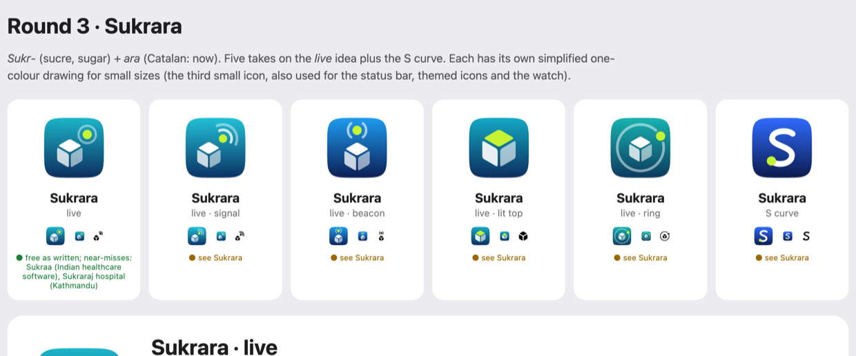
The user found the small one-colour version weak: the semi-transparent faces turned grey and the badge ring merged into the cube. Two generator changes fix that for every candidate:
- A separate small-size drawing (
mono=in a concept) is used for the Android themed icon, the status-bar icon, the menubar glyph and the watch. The cube there has opaque faces with wider gaps (no alpha), and nothing overlaps. This is how SF Symbols and Material icons stay legible. - The themed icon can have its own drawing too (
themed=). Android tints the monochrome layer but keeps its alpha, so Sukrara · live’s themed icon uses three face opacities, with the dot tucked against the cube. The tiny glyphs keep their solid faces. - The small glyph is cropped to its content. Each glyph is cropped tight around its paths, so it fills the 16–24 px box. Arcs are measured exactly; the first version used only the endpoints and cut off the status ring.
python3 -I brand.py sheet sukrara renders just these variants at 24 and 16 px on white and on dark.
Search (2026-10-16): no exact use. The near-misses are Sukraa, Indian healthcare ERP software, and Sukraraj Tropical and Infectious Disease Hospital in Kathmandu. Sanskrit śukra (Venus) shows up as well.
In context
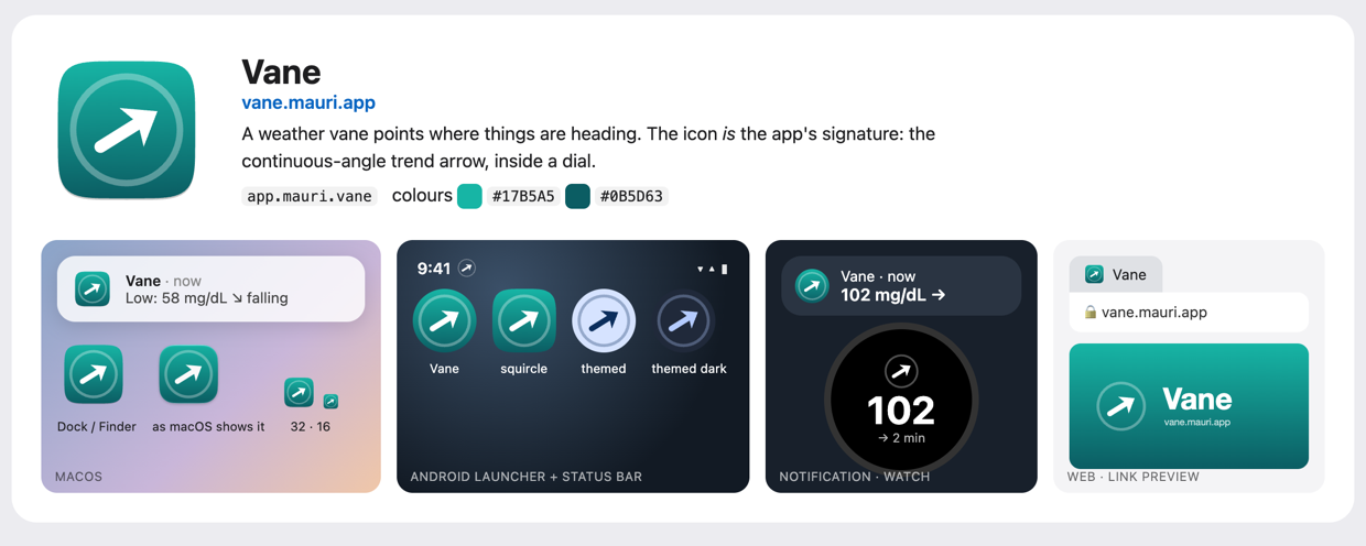
Section titled “In context”Each candidate is shown where it will live: a macOS notification and Dock, the Android launcher (circle and squircle masks, themed light/dark), the status bar, a notification row, a Garmin watch, and a browser tab with the link-preview image:
On the phone
Section titled “On the phone”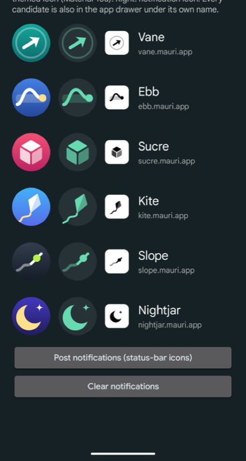
poc/spikes/brand/android (Brand preview, dev.spike.brandpreview) puts every candidate in the app drawer under
its own name, using one activity-alias per icon. In the app, each row shows:
- the launcher icon as the phone masks it, from
PackageManager.getActivityIcon; - the themed icon: the monochrome layer tinted with the wallpaper’s Material You colours (here the user’s green), the same way Pixel’s themed icons do it;
- the notification small icon.
Findings on the Pixel 10 Pro (Android 17):
- All six adaptive icons, including their
<monochrome>layers, render correctly from the generated VectorDrawables. Themed icons work for every candidate. - Notification rows show the app’s launcher icon, not the small icon. The six test notifications were grouped under the Vane alias’s launcher icon. So the launcher icon matters inside notifications too.
- While the glucose Live Update chip from 05 was showing, the status bar showed no
notification icons for any app, including WhatsApp. So the small icon couldn’t be checked in place; the preview
app shows it instead. It is still required by the API and is generated as
ic_stat_<id>.xml.
Style decisions
Section titled “Style decisions”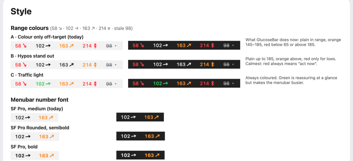
These are rendered by the real TrendArrow.swift and AppKit fonts, on light and dark menubars:
| Kit | Below 65 | 65–145 | 145–185 | Above 185 |
|---|---|---|---|---|
| A · Colour only off-target (today) | red | plain | orange | red |
| B · Hypos stand out | red | plain | plain | orange |
| C · Traffic light | red | green | orange | red |
Number font: SF Pro medium with monospaced digits (today), SF Pro Rounded semibold, SF Pro bold, or SF Mono. The differences are small at menubar size. Rounded looks friendlier; Mono looks more “instrument”.
Carried over unchanged:
- mg/dL, with thresholds 65 / 145 / 185;
- stale after 5 min (grey + strikethrough);
- the continuous arrow (±3 mg/dL/min = vertical, double chevron beyond);
- Apple system colours on both platforms, so the Mac and the phone show the same red, orange and green.
How it works
Section titled “How it works”brand.py ── concept = shapes on Android's 108-unit adaptive canvas (one definition per icon) ├─▶ SVG: macOS squircle (Big Sur grid), Android masks, themed, glyph, favicon, link preview ──▶ gallery (HTML) ├─▶ VectorDrawable XML: adaptive background / foreground / monochrome + ic_stat ──▶ preview APK / showcase app └─▶ render.swift (AppKit) ──▶ PNGs, .icns (iconutil), menubar mock-ups (real TrendArrow), "what macOS shows"- Each icon is a list of paths (filled or stroked, with alpha) in one coordinate system: Android’s 108-unit
adaptive-icon canvas. The visible area is 18..90 and the glyph stays inside a radius of about 26. For macOS, that
visible area is mapped onto the 824-px squircle of Apple’s 1024 grid. For small mono uses (status bar, menubar,
watch), the canvas is cropped to 24..84. No external tools are needed: Python stdlib,
swiftc,iconutil, and Chrome for one image. - macOS 27 shows the generated
.icnsunchanged.NSWorkspace.icon(forFile:)on a stub.appreturns the icon as drawn, with no grey “legacy icon” frame (the gallery’s “as macOS shows it” tile). The stub needs a real executable; without one macOS shows its “can’t open” icon instead. - AppKit’s built-in SVG renderer handles gradients, alpha and arcs but ignores
font-weight. The one image with text (og.png, the link preview) is therefore rendered with headless Chrome. - Strokes thinner than about 4 units (Kite’s tail, Slope’s curve) are the first to break up at 16 px; the solid shapes (Sucre, Nightjar, the Vane arrow) hold up best.
Use it
Section titled “Use it”cd poc/spikes/brandpython3 -I brand.py gallery # build everything, open the gallerypython3 -I brand.py export vane a # chosen candidate + range kit → assets/vane/ (commit this)cd android && ./gradlew assembleDebug && adb install -r -g app/build/outputs/apk/debug/app-debug.apkadb uninstall dev.spike.brandpreview # removes the six launcher entries againexport writes assets/<id>/:
brand.json: name, domain, application ids, colours, thresholds;macos/:AppIcon.icns, a 1024 master, the menubar template glyph,Brand.swift;android/res/: the adaptive icon with its monochrome layer andic_stat_<id>, plusBrand.ktand a 512 store icon;garmin/: launcher icons, colour and mono, 40–80 px;web/: favicon (SVG + 32), apple-touch-icon, PWA 512,og.png.
A README.md in the folder says what goes where.
For the showcase app
Section titled “For the showcase app”- Name Sukrara. Ids:
app.mauri.sukrara.pocfor the showcase app, which leavesapp.mauri.sukrarafree for the final app so both can be installed side by side. Website:https://sukrara.mauri.app. - Everything is in
poc/spikes/brand/assets/sukrara/(its README says what goes where).brand.json,Brand.ktandBrand.swiftcarry the name, URL and colours. - Copy
assets/sukrara/android/resinto the app and setandroid:icon="@mipmap/ic_launcher". On the Mac, putAppIcon.icnsinContents/Resourcesand setCFBundleIconFile. Useic_stat_sukraraas the notification small icon; on the Mac,MenubarGlyphis a template image for menus and “no data yet”. - The battery spike (
poc/spikes/power) will measure the showcase app. What it needs from the app (adb/DUMP-protected feature toggles, upload intervals…) is inpoc/spikes/power/README.md. Message that session when the app is installed on the phone.
In Sukrara
Section titled “In Sukrara”- Added: the committed set in
assets/brand/sukrara/;tools/brand/store_icons.pyrenders the Play Store icon and the apple-touch-icon frombrand.py’s shapes, cropped to the 72-unit area launchers show (18 18 72 72). - Discarded:
brand.py’s own renders of those two, made from the whole 108 canvas: the bleed shrank the glyph to 2/3 of the launcher’s size (#210). And its renderer,render.swift, which no longer builds (TrendArrow.swiftneeds aTrendMarkit doesn’t list);tools/brand/svg2png.swiftdoes the same SVG drawing.
- Name and icon picked: Sukrara · live. Assets exported to
assets/sukrara/. - Range colours and menubar font were left at today’s defaults (A, SF Pro medium). To change them, run
brand.py export sukrara <kit>. - Register
sukraraas a domain you own outright (plus the likely misspelling sucrara) before the final app. - Final app: a macOS 26+ Icon Composer
.icon(Liquid Glass layers). That needs Xcode’sactool, which this machine doesn’t have (Command Line Tools only). - A wordmark/logotype, if the website needs more than the name set in the system font.
- Garmin: check the
launcherIconsize the Connect IQ device profile wants for the Instinct 3 when the watch app is built.